


What Mark Carney articulated at Davos this week was not a diplomatic disagreement but a structural one... and he was direct and blunt about it.
The global trade and financial system that once promised mutual benefit through integration, now increasingly drives advanced economies towards fragility and dependence. Decades of global integration, reserve-currency privilege, and free movement of capital have outsourced productive capacity while concentrating power and wealth in the hands of the few who hold the financial asset cards.
Under this cycle's late-stage conditions, the system no longer spreads prosperity. Trade becomes leverage, finance becomes coercion, and supply chain vulnerabilities become instruments of pressure.
The shared nationalist and populist politics now emerging are not simple ideological coincidents, they are the political expression of an economic system that has reached late Quadrant C (all terms will be defined).
—
The mechanisms behind this shift are not new, they've been repeated numerous times in history, and they are now clear for us all to see.
Reserve-currency privilege, persisourtent deficits, and financial dominance have produced effects long associated with Dutch disease (terms defined below), which is now operating at the scale of the global system... what Triffin described as a "monetary dilemma" has evolved into a political constraint leaving politics with fewer and fewer choices, while hyperfinancialisation has replaced production with asset inflation - for controllers of significant assets - as the engine of growth.
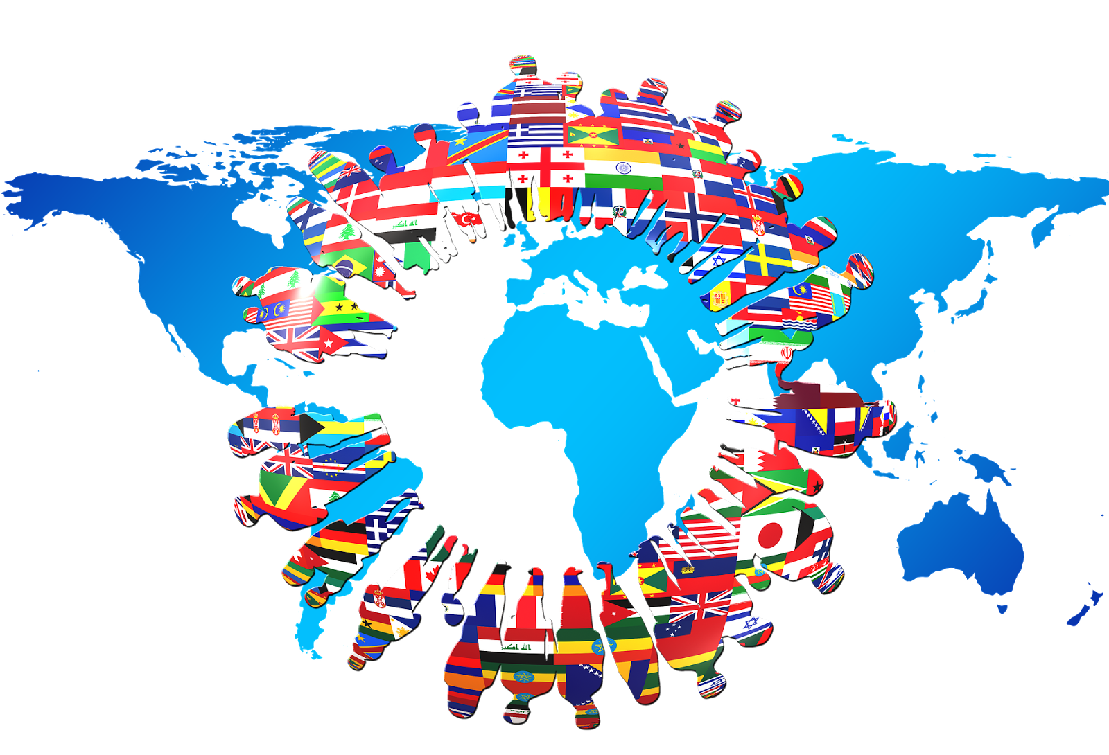
The result is rising inequality which, accompanied by large-scale and continuous immigration, is leading to societal fragmentation, strategic vulnerability, and a marked and uncompromising narrowing of political choice.
This piece describes the system in plain economic terms, and is my understanding of the late-stage Quadrant C regime dynamics increasingly feeding the politics of the developed world.

1. The Common Thread
Dutch disease, Triffin’s dilemma, hyperfinancialisation, and inequality are not separate problems.
They describe different stages and symptoms of the same structural imbalance:
• A nation gains an external advantage
• That advantage distorts incentives
• Capital flows away from productive activity
• Finance expands faster than the real economy
• Wealth concentrates
• Social and political strain follows.
These symptoms seen together, allow us to diagnose late-stage economic systems.
2. Dutch Disease. When Success Hollow-Outs The Economy
Dutch disease is the paradox where economic success in one sector damages the rest of the economy.
• Originally observed in the Netherlands after natural gas discoveries
• Large export revenues strengthen the currency
• A strong currency makes manufacturing and tradable services uncompetitive
• Labour and capital move into the booming sector and non-tradables.
The result is:
• Deindustrialisation
• Loss of skills
• Long-term dependency on a narrow income source.
In modern economies, the “resource” is often not oil or gas, it is finance.
Glossary
Dutch disease: A condition where large foreign income inflows raise the exchange rate and undermine domestic industry.
3. Triffin’s Dilemma. The Global Version Of Dutch Disease
Triffin’s dilemma applies Dutch disease logic at the level of the global monetary system.
• A reserve-currency country must supply the world with liquidity
• This requires persistent trade deficits
• Trade deficits weaken domestic industry
• Domestic political pressure rises.
The issuer of the reserve currency faces a choice:
• Serve global stability
• Or protect domestic economic balance.
It cannot do both indefinitely.
The United States exemplifies this tension -
• Dollar dominance benefits finance and geopolitics
• At the same time it accelerates deindustrialisation and debt accumulation at home.
Glossary
Triffin’s dilemma: The structural conflict faced by a reserve-currency issuer between domestic stability and global liquidity provision.
4. Hyperfinancialisation.
When Finance Becomes The Economy
Financialisation becomes hyperfinancialisation when finance stops serving production and starts replacing it.
Key features:
• Profits increasingly come from asset prices, not output
• Credit creation outpaces real economic growth
• Corporate strategy prioritises buybacks, leverage, and arbitrage rather than re investment of profits
• Housing and equities become the main savings vehicles.
This is Dutch disease without a mine or oil field. Finance itself becomes the extractive sector.
Consequences:
• Fragile growth
• Rising systemic risk
• Chronic dependence on monetary stimulus.
Glossary
Hyperfinancialisation: An advanced stage of financialisation where financial activities dominate economic returns and policy priorities.
5. Inequality. The Social Balance Sheet
Inequality is not a moral failure, but it is an accounting outcome.
Hyperfinancialised systems naturally generate inequality because:
• Asset ownership is concentrated
• Monetary easing inflates asset prices first
• Wages lag productivity and prices
• Debt substitutes for income growth.
Those with assets compound wealth, those without fall behind.
Over time:
• Trust in institutions erodes
• Political polarisation increases
• "Society" buckles and fragments.
Inequality is the visible scar tissue of these structural imbalances.
Glossary
Inequality: Persistent disparities in income, wealth, or opportunity across a population.
6. Putting It Together. A Single Causal Chain
The sequence is not accidental.
• Reserve-currency status triggers Triffin’s dilemma.
• Triffin dynamics resemble Dutch disease effects.
• Deindustrialisation and capital surpluses fuel hyperfinancialisation.
• Hyperfinancialisation amplifies inequality.
Each stage reinforces the next.
This is why policy responses that treat these issues separately often fail - they address symptoms rather than root causes.
7. Counterarguments And Limits
Looking at late stage quadrant C from the other point of view, trying to be balanced and positive:
• Financialisation can improve capital allocation in early stages
• Reserve-currency status lowers borrowing costs and geopolitical risk
• Inequality can reflect skill premia and innovation, not just extraction.
The problem is not finance itself, but it is scale, duration, and feedback loops.
Systems break when corrective mechanisms are suppressed too long.
8. Why This Matters Now
These dynamics are most dangerous late in the cycle:
• When debt is high
• When growth is weak
• When trust is thin.
At that point:
• Inflation re-emerges through scarcity, not demand (see Note)
• Politics turns inward
• Capital seeks real assets over paper claims.
History suggests adjustment is inevitable... the question is whether it is gradual or disorderly, but agreed or forced.
References And Further Reading
• Triffin, R. “Gold and the Dollar Crisis”
https://www.bis.org/publ/othp04.htm
• IMF. “Dutch Disease Revisited”
https://www.imf.org/external/pubs/ft/wp/2007/wp0702.pdf
• OECD. “Financialisation and Its Impacts”
https://www.oecd.org/finance/financialisation.htm
• Piketty, T. “Capital in the Twenty-First Century”
https://www.hup.harvard.edu/books/9780674979857
NOTE 1. HOW INFLATION RE-EMERGES THROUGH SCARCITY, NOT DEMAND
In late-cycle systems, inflation no longer originates from excess consumer demand.
It emerges from constraints.
• Years of underinvestment reduce productive capacity
• Deindustrialisation weakens domestic supply chains
• Energy, metals, labour, logistics and housing become bottlenecks
• Shocks propagate through fragile, tightly coupled systems
Money may be abundant, but goods, skills, energy, and infrastructure are not.
Prices rise because supply cannot respond, not because consumers are bidding more aggressively.
This is why traditional demand-management tools fail (see Note 4).
Raising rates suppresses demand but does not create mines, refineries, housing, engineers, or energy grids.
Scarcity inflation: Inflation driven by physical or structural supply limits rather than excess demand.

NOTE 2. WHY THE RESERVE-CURRENCY ISSUER MUST SUPPLY GLOBAL LIQUIDITY
The global system requires a shared settlement asset:
• Trade, commodities, debt and reserves must clear in a trusted currency
• The reserve currency must be available outside the issuing country
• Foreign access requires net currency outflow.
This forces the reserve-currency issuer to run persistent deficits.
Mechanisms include:
• Trade deficits
• Capital account surpluses are the other half of the accounting equation
• Offshore currency creation via banking and shadow banking.
If the issuer restricts liquidity:
• Global trade seizes
• Credit crises erupt
• The currency will strengthen violently
Thus the issuer is trapped between domestic balance which requires restraint and global stability which requires excess supply.
Global liquidity: The availability of a currency for international trade, finance, and reserve use.

NOTE 3. WHY CAPITAL ROTATES AWAY FROM PAPER CLAIMS TOWARDS REAL CONSTRAINTS
Paper claims depend on confidence:
• Bonds rely on future repayment capacity
• Equities rely on future earnings
• Fiat money relies on policy and government credibility.
When systems are over-leveraged and growth is constrained, future promises are discounted more heavily.
This is when capital seeks what cannot be diluted (debased) and investors seek assets that will protect their purchasing power, starting with gold precious metals.
Rotation out of financials continues into commodities - assets constrained by physics, geology, or biology, such as:
• Energy reserves
• Industrial metals
• Agricultural land
• Infrastructure
• Physical commodities
• Strategic inputs
These are not inflation hedges in the early stage, but they become inputs once scarcity bites.
Real constraints: Physical limits on supply that cannot be expanded by monetary policy or financial engineering.
This is why late-cycle capital flows do not chase growth stories, they (investors) will chase bottlenecks.

NOTE 4. WHY DEMAND MANAGEMENT BREAKS DOWN IN SCARCITY-DRIVEN INFLATION

Thank you for reading this far.


